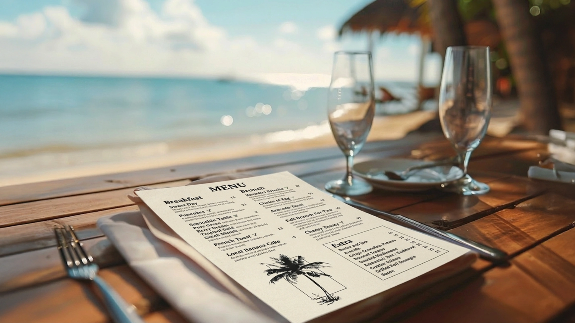
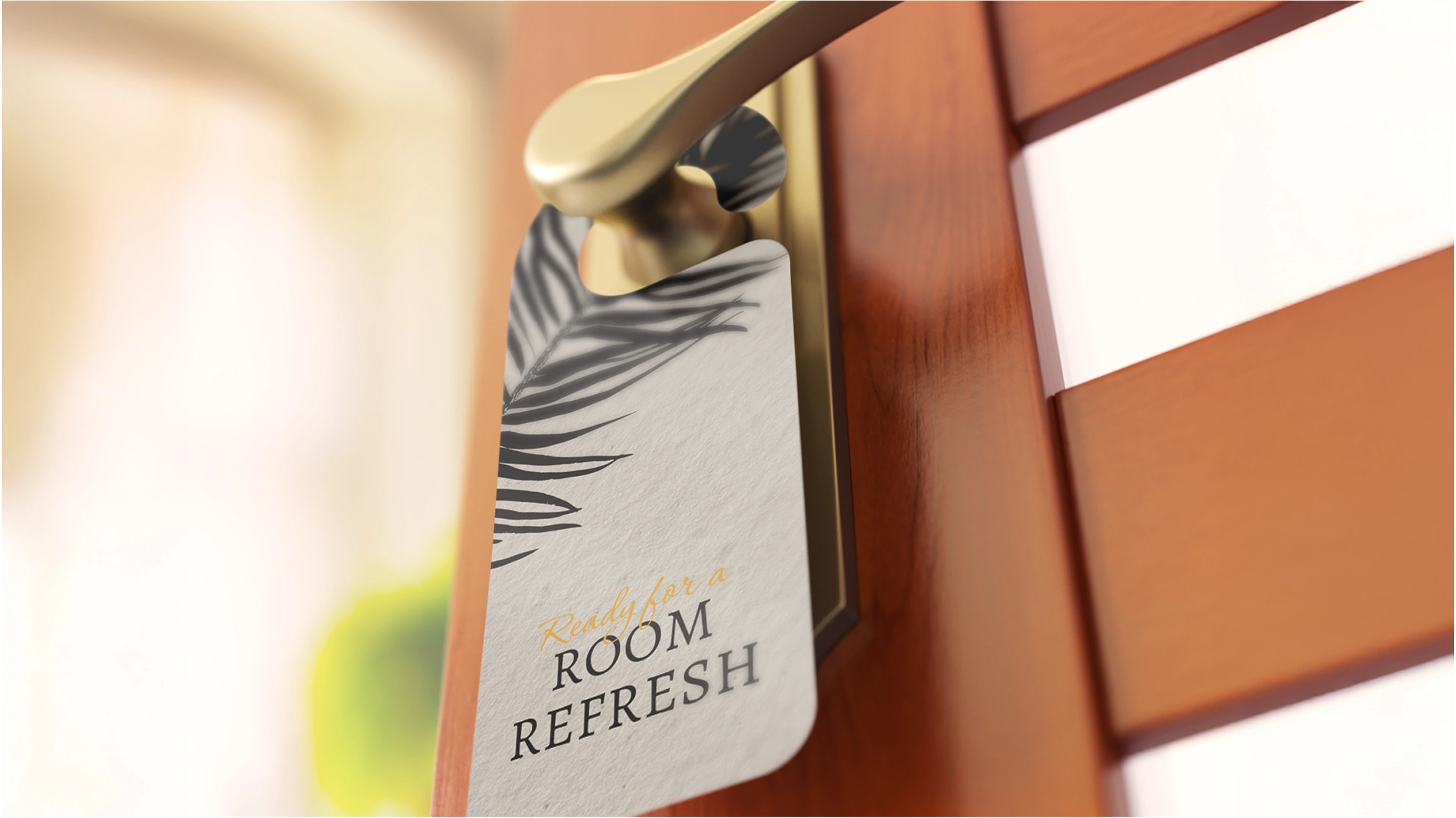
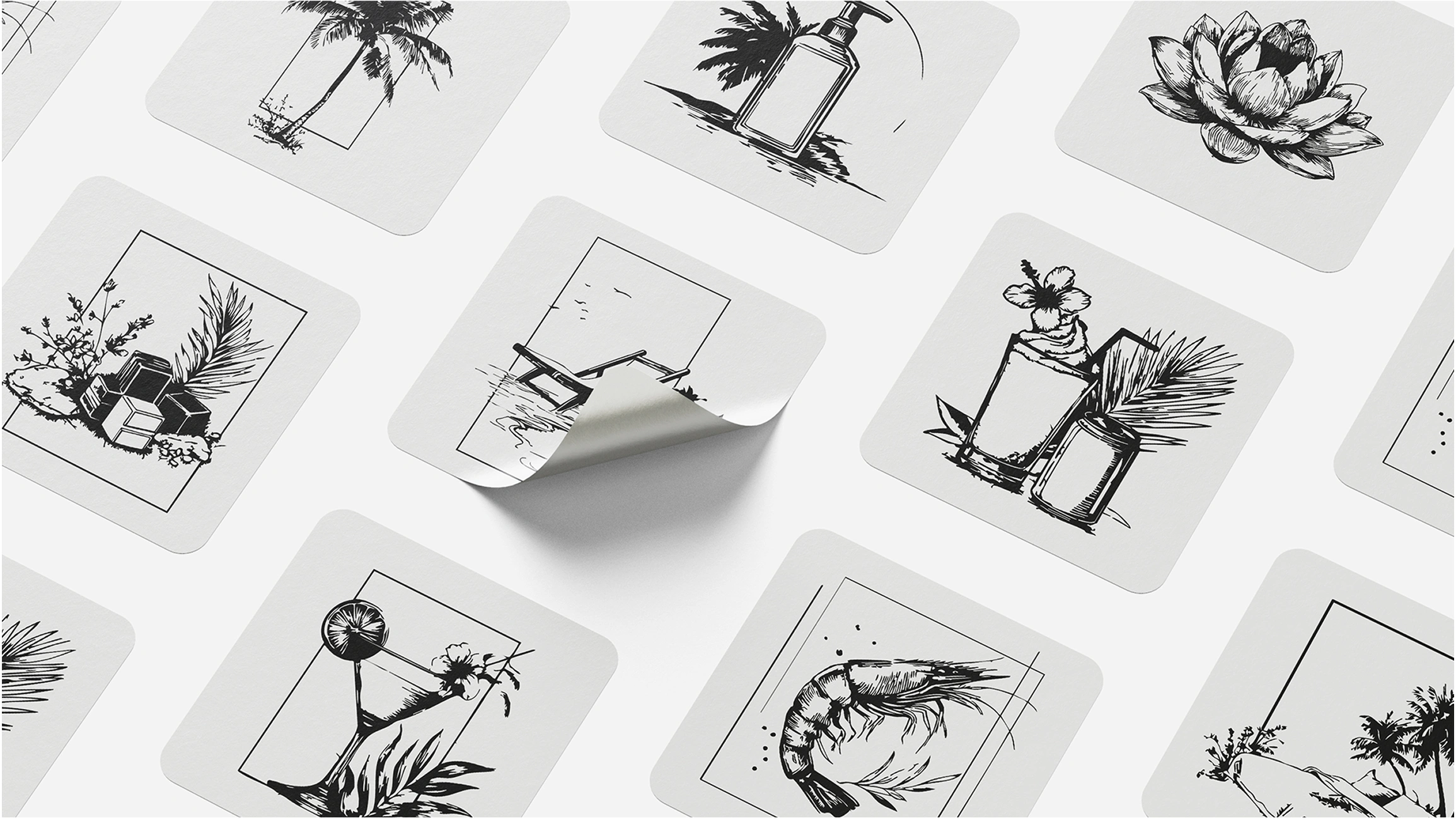
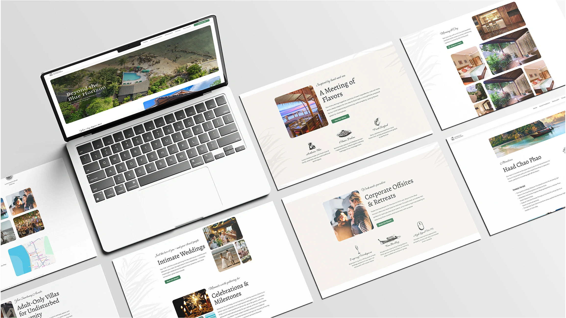
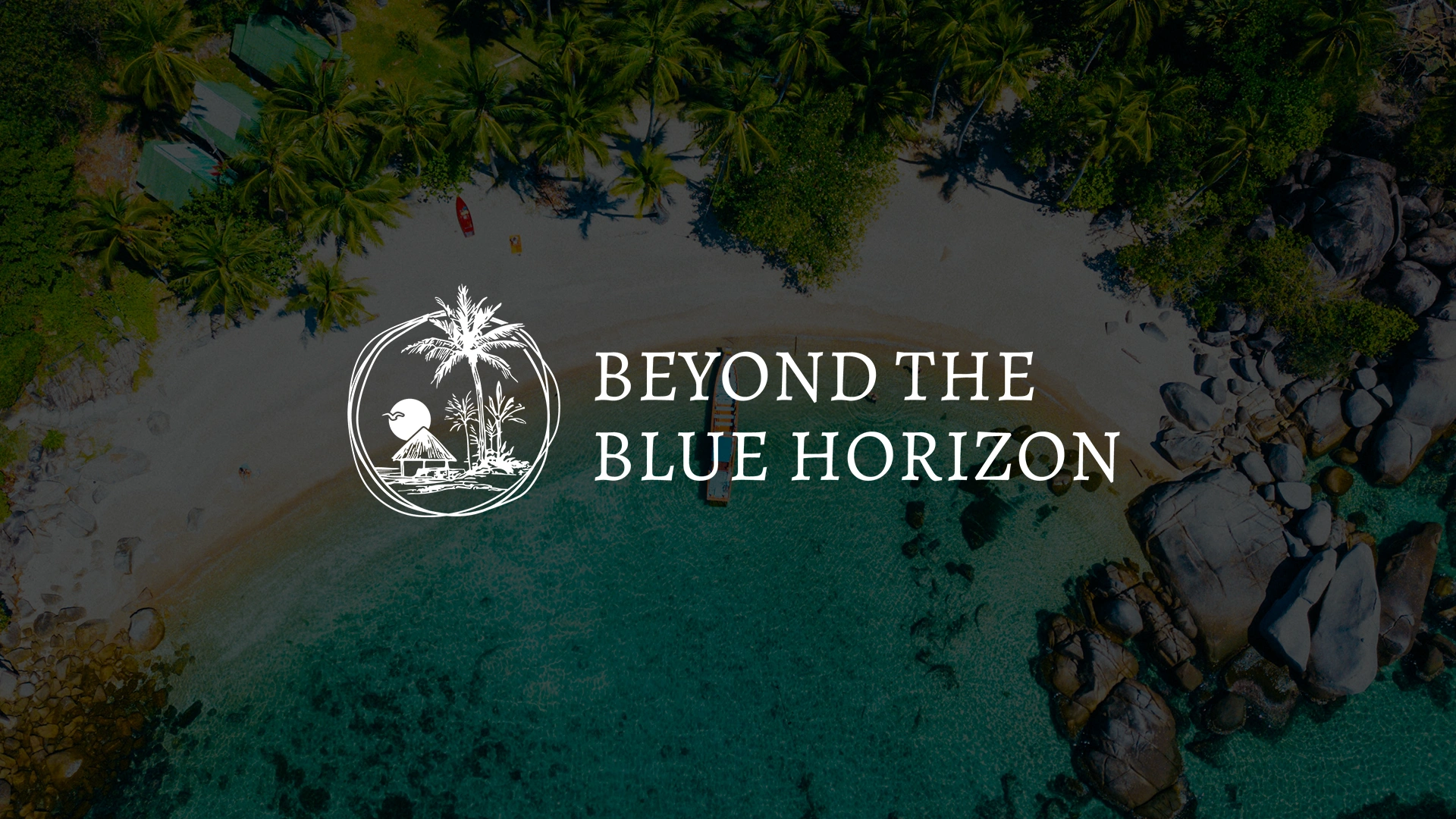
Visual Direction & Approach
The visual system is built around restraint and detail. Key principles included:
- Hand-drawn illustrations to add warmth, personality, and authenticity
- Minimal compositions that allow the experience to breathe
- A calm, natural color palette
- Subtle graphic elements that support content rather than compete with it
Every element was designed to feel intentional — from icons and illustrations to layouts and spacing.
Process
The process began with defining the emotional direction of the brand: What should a guest feel when encountering the brand for the first time? How does the brand translate calm, escape, and care into visuals?
From there, I developed:
- A consistent illustration and icon system
- Visual rules for applying the brand across different formats
- Design assets that can scale and adapt without losing their identity
Process
- A cohesive, recognizable brand language
- A strong visual identity that supports both storytelling and functionality
- Design assets that enhance the guest experience across touchpoints
- A brand that feels personal, thoughtful, and carefully crafted