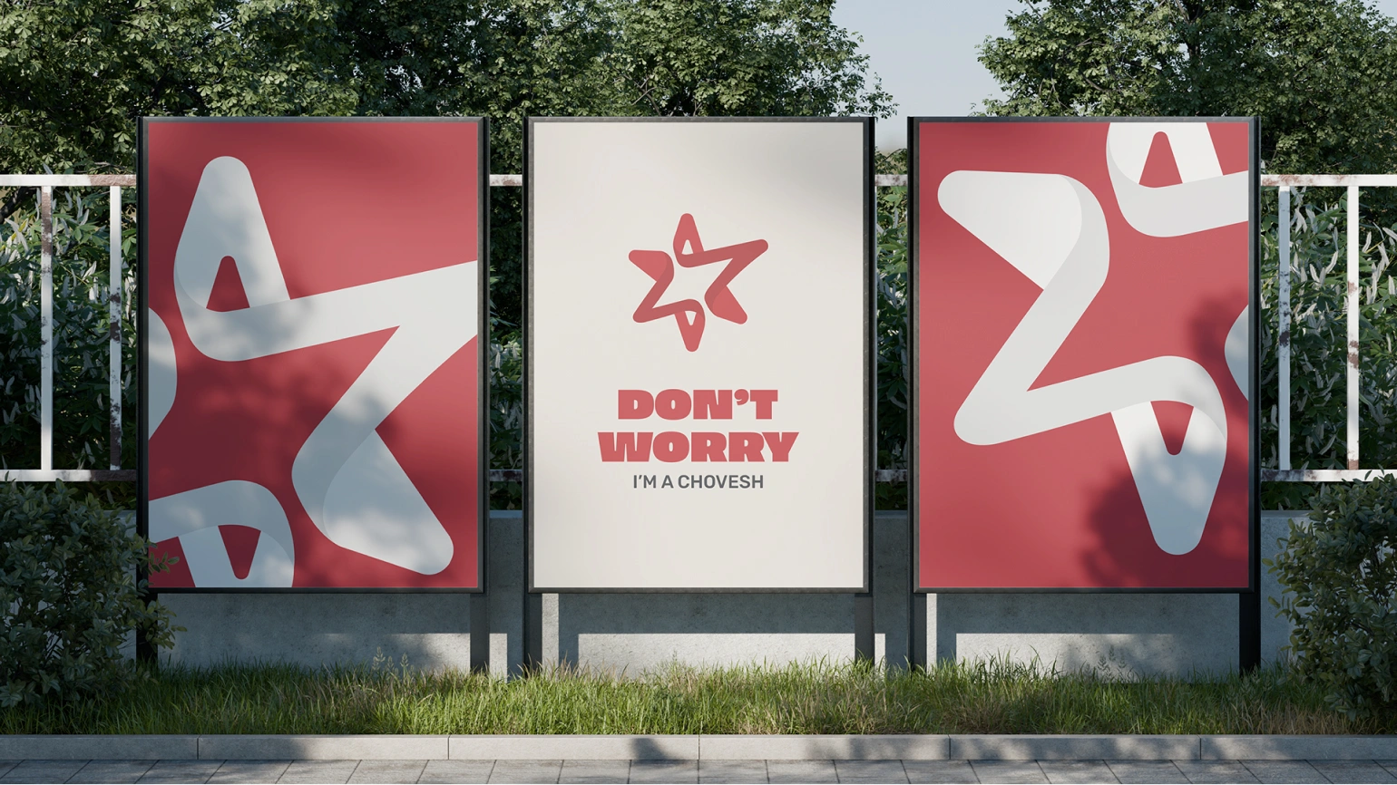
The Israeli Paramedics Association represents medical professionals working in high-pressure, life-saving environments. The goal of this project was to create a clear, professional brand that reflects authority and trust, while still feeling accessible and community-driven.
The brand needed to balance multiple values:
- Professionalism and credibility
- Human connection and community
- Clear communication across events, materials, and merchandise
It was essential that the visual language felt serious and respectful, without becoming cold or distant.